A switching-what?
The concept an experiment is a familiar concept for most of us. But experiments come in many tastes and flavours! Ask researchers what an experiment is, then I guess that most of them would refer to what is commonly called a randomized controlled experiment. In a randomized controlled experiment a researcher is in full control, making use of a randomization procedure to assign participants to any of the conditions in the experiment. By setting up such an experiment a researcher hopes to have strong control on possible confounding variables increasing the internal validity of the results by doing so (Shadish, Cook, and Campbell 2002).
Now, imagine you are a researcher in the education sciences and you have some hypothesis you want to test on an instructional strategy. Based on the theory you expect that the students who were subjected to this instructional strategy applied to a certain knowledge domain will strongly outperform other students, who didn’t receive this specific instructional strategy. From a methodological point of view you would preferably use some kind of randomized assignment of students to one of both conditions (‘your intervention that mimics the principles of the intervention strategy’ and a ‘business as usual’ condition). The other side of the coin is that you deny some students the best possible learning opportunity which leads to unequal treatment of students. An ethical advisory board in your research institution may oppose to your plans! Now what? Of course this ethical reflex is not unique in educational research and can be a concern in a large number of disciplines.
One of the designs that Shadish, Cook, and Campbell (2002) discuss in their in-depth exposition of (quasi-) experimental designs, the ‘switching-replications’ design, could be a highly valuable solution here. The basic design of the study is depicted in the flowchart in Figure 1.
Show code
grViz("switching_replications.gv")
Figure 1: Diagram of a basic switching replications design
Key in this design is that a researcher does the intervention more than once. A random group of the participants gets some kind of delayed intervention. In the flowchart above we have participants assigned to Group1 who will receive the intervention immediately after they took a pretest. After the intervention they take a posttest. Participants in Group2 will receive ‘business as usual’ after they took the pretest and take the same posttest as participants in Group1. After that first posttest the roles are ‘switched’. Now participants in Group2 receive the intervention while participants in Group1 receive ‘business as usual’. Finally both groups take a posttest again.
In the end all participants get the ‘treatment’! And, even better, we actually replicate our study by design. The hypothesis that the instructional strategy improves knowledge is tested twice within our study. Great, no?
The case
Let’s make it more concrete and apply it to a fictitious example. Imagine that you are an educational researcher interested in how to learn undergraduate students efficient statistical programming in R! You have encountered some cognitive psychological research that states that students learn more from comparing exemplars than that they learn from inspecting singular examples (see Alfieri, Nokes-Malach, and Schunn 2013 for a meta-analysis on this topic). Your key research question states:
Can we conceptually replicate this ‘learning through case-comparison’ effect when applied to learning efficient statistical programming in R?
Luckily you have a group of 150 graduate students at your disposal. You design an intervention in which students are invited to the computer lab and start with a coding task in R that you will later on score (of course with all methodological rigour making use of multiple independent raters etc). The results for this task will be used as a pretest.
Randomly you assign the 150 students to two groups:
- Group1: they are presented 6 pairs of short coding blocks to perform certain data-manipulation steps combined with some plotting. Each pair is deliberately designed so that both exemplars differ on some key principle in coding. Participants are asked to outline the most salient differences in both coding blocks in a pair and then are asked to go to the next pair.
- Group2: they are presented with the same coding blocks as the students in Group1 but they get to see them one by one. For each of the coding blocks the students are asked to list pro’s and con’s on how the coding is done.
After this first phase both groups of students get a new coding task. The scores they receive will be used as posttest 1. After the completion of that task both groups get a small break, can have some coffee, etc. When they are back in the computer lab they are again confronted with new exemplars on similar content but now Group1 gets them presented one by one while Group2 gets them presented as pairs. The conditions are switched.
Finally, both groups of students execute a similar task as the previous two which results in a posttest 2.
Let’s visualize the resulting data:
Show code
Switch_data %>%
  pivot_longer(
    c(Pretest_score, Posttest_score1, Posttest_score2)
  ) %>%
  mutate(
    Occasion = case_when(
      name == "Pretest_score" ~ 1,
      name == "Posttest_score1" ~ 2,
      name == "Posttest_score2" ~ 3
    )
  ) %>%
  ggplot() +
  geom_jitter(aes(x = Occasion, y = value, color = Group), width = .25) +
  scale_color_brewer(palette = "Set2") +
  scale_x_continuous(breaks = c(1,2,3)) +
  theme_ggdist()
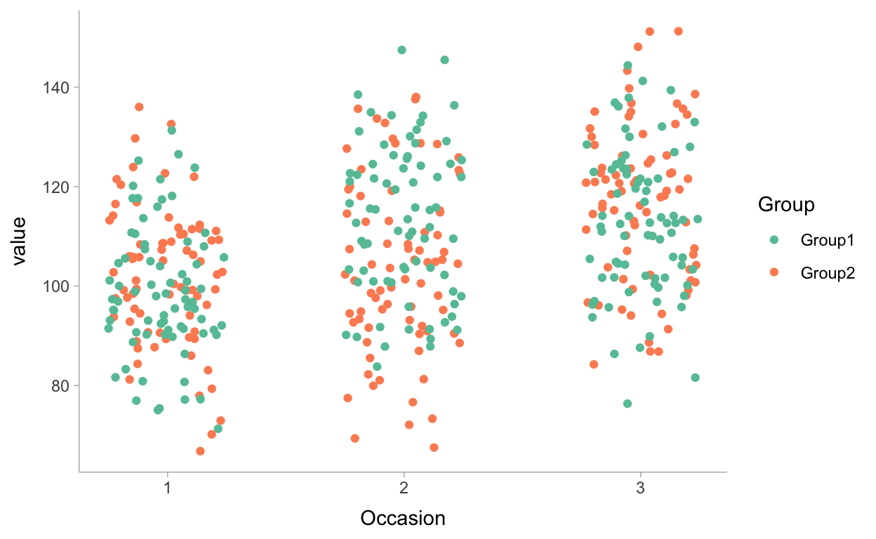
Figure 2: Jitter plot of scores of students on the three coding tasks, colored by group
A first peek at this figure indicates that the data is somewhat in line with what we could expect based on the theory: (1) scores of students in Group1 are increased between occasion 1 and occasion 2; and (2) scores of students in Group2 are increased between occasion 2 and occasion 3.
Statistical models
Of course, a thorough statical modelling can help us somewhat further! Time to build models and to estimate them.
One way to approach the situation at hand is making use of a multivariate model. In a multivariate model we integrate multiple dependent variables in a model. In our case this would imply that we model 3 dependent variables: pretest, posttest1 and posttest 2 scores.
A first model (Model1) is an unconditional model not taking into account the possible effects of the intervention. Formally this model can be written as,
\[\begin{equation} \begin{aligned} \begin{bmatrix} \text{pretest}_{i}\\ \text{posttest1}_{i}\\ \text{posttest2}_{i} \end{bmatrix} & \sim \textbf{ MVNormal} \left( \begin{bmatrix} \mu_{1} \\ \mu_{2} \\ \mu_{3} \end{bmatrix} , \Sigma_1 \right) \\ \mu_{1} & = \beta_{01} \\ \mu_{2} & = \beta_{02} \\ \mu_{3} & = \beta_{03} \\ \Sigma_1 & = \textbf{S}_1\textbf{R}_1\textbf{S}_1 \\ \textbf{S}_1 & = \begin{bmatrix} \sigma_{e_{1i}} & 0 & 0 \\ 0 & \sigma_{e_{2i}} & 0 \\ 0 & 0 & \sigma_{e_{3i}} \end{bmatrix}\\ \textbf{R}_1 & = \begin{bmatrix} 1 & \rho_{e_{1i}e_{2i}} & \rho_{e_{1i}e_{3i}} \\ \rho_{e_{2i}e_{1i}} & 1 & \rho_{e_{2i}e_{3i}} \\ \rho_{e_{3i}e_{1i}} & \rho_{e_{3i}e_{2i}} & 1 \end{bmatrix}\\ \end{aligned} \end{equation}\]
with \(\beta_{01} \rightarrow \beta_{03}\) being the expected mean values for each test and allowing the residuals \(e_{1i} \rightarrow e_{3i}\) to be correlated.
Now, of course our hypothesis is that students in Group1 will learn more than students in Group2 which is reflected in a difference between both groups when we look at the posttest 1 scores. Therefore, we introduce the effect of the dummy variable Group1 (which has value 1 for students in Group 1 and value 0 for students in Group 2) as a predictor for posttest 1 (Model2). For posttest 2 we no longer expect a difference between both groups because Group2 students will also have received the intervention:
\[\begin{equation} \begin{aligned} \begin{bmatrix} \text{pretest}_{i}\\ \text{posttest1}_{i}\\ \text{posttest2}_{i} \end{bmatrix} & \sim \textbf{ MVNormal} \left( \begin{bmatrix} \mu_{1} \\ \mu_{2} \\ \mu_{3} \end{bmatrix} , \Sigma_1 \right) \\ \mu_{1} & = \beta_{01} + \\ \mu_{2} & = \beta_{02} + \beta_{12} * \text{Group1} \\ \mu_{3} & = \beta_{03} + \\ \Sigma_1 & = \textbf{S}_1\textbf{R}_1\textbf{S}_1 \\ \textbf{S}_1 & = \begin{bmatrix} \sigma_{e_{1i}} & 0 & 0 \\ 0 & \sigma_{e_{2i}} & 0 \\ 0 & 0 & \sigma_{e_{3i}} \end{bmatrix}\\ \textbf{R}_1 & = \begin{bmatrix} 1 & \rho_{e_{1i}e_{2i}} & \rho_{e_{1i}e_{3i}} \\ \rho_{e_{2i}e_{1i}} & 1 & \rho_{e_{2i}e_{3i}} \\ \rho_{e_{3i}e_{1i}} & \rho_{e_{3i}e_{2i}} & 1 \end{bmatrix}\\ \end{aligned} \end{equation}\]
To better understand what we assume in Model 2 we can visualize hypothetically what our model results would look like if this model is a good model:
Show code
Scores <- c(100,100,115,100,115,115)
Occasion <- c(1, 1, 2, 2, 3, 3)
Group <- c("Group1", "Group2", "Group1", "Group2",  "Group1", "Group2")

P1 <-
  ggplot(data = data.frame(Scores, Occasion, Group),
       aes( x = Occasion, y = Scores, color = Group)) +
  geom_line() +
  geom_point() +
  scale_color_brewer(palette = "Set2") +
  scale_x_continuous(breaks = c(1,2,3)) +
  scale_y_continuous(labels = NULL) +
  geom_label(aes(x = 1.5, y = 101, label = "No effect for Group2"), color = "#FC8D62", size = 3, label.size = NA) +
  geom_label(aes(x = 1.4, y = 110, label = "Effect for Group1"), color = "#66C2A5", size = 3, label.size = NA) +
  geom_label(aes(x = 2.4, y = 110, label = "Effect for Group2"), color = "#FC8D62", size = 3, label.size = NA) +
  geom_label(aes(x = 2.5, y = 116, label = "No effect for Group1"), color = "#66C2A5", size = 3, label.size = NA) +
  theme_ggdist() + ggtitle("Model 2")

Scores <- c(100,100,115,100,120,115)

P2 <-
  ggplot(data = data.frame(Scores, Occasion, Group),
       aes( x = Occasion, y = Scores, color = Group)) +
  geom_line() +
  geom_point() +
  scale_color_brewer(palette = "Set2") +
  scale_x_continuous(breaks = c(1,2,3)) +
  scale_y_continuous(labels = NULL) +
  geom_label(aes(x = 1.5, y = 101, label = "No effect for Group2"), color = "#FC8D62", size = 3, label.size = NA) +
  geom_label(aes(x = 1.4, y = 110, label = "Effect for Group1"), color = "#66C2A5", size = 3, label.size = NA) +
  geom_label(aes(x = 2.4, y = 110, label = "Effect for Group2"), color = "#FC8D62", size = 3, label.size = NA) +
  geom_label(aes(x = 2.5, y = 121, label = "Sustained effect for Group1"), color = "#66C2A5", size = 3, label.size = NA) +
  theme_ggdist() + ggtitle("Model 4")

P1 / P2 + plot_layout(guides = "collect")
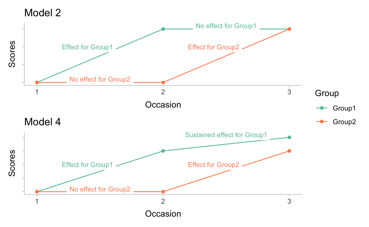
Figure 3: Expectations from Model 2 and Model 4 visualized
In model 2 we have potentially a naive idea on the effect of the intervention. If we visualize our hypothesis (see Figure 3) it shows that we assume no systematic change in scores any more between occasion 2 and 3 for Group1. Moreover, in model 2 we do not assume any difference between both groups at the start of the experiment neither. In other words we assume that our randomization has worked 100% perfect.
To test these assumptions we introduce 3 other models that each releases a restriction that we supposed in Model 2:
- Model 3: Model 2 + an effect of Group1 at the pretest
- Model 4: Model 2 + an effect of Group1 at the posttest2
- Model 5: Model 2 + an effect of Group1 at the pretest and the posttest2
Time to switch to brms!
We have models, we have data, now it’s time to run our analyses. As will hopefully become clear in what follows a Bayesian analysis will be of great value in our situation. For the analyses we will rely on brms as it allows us an easy framework to apply Bayesian inferences making use of the Stan (Stan Development Team 2020b). One of the many great features of brms is that the formulation of a multivariate model is ‘easy peasy’. Let’s demonstrate it for Model1:
Show code
M1 <- brm(
  bf(Pretest_score ~ 1) +
    bf(Posttest_score1 ~ 1) +
    bf(Posttest_score2 ~ 1) +
    set_rescor(rescor = TRUE),
  data = Switch_data,
  seed = 2021,
  cores = 4
  )
The magic happens in the three bf( ) statements that are combined making use of the + sign. Each bf( ) statement models one of the different dependent variables. In this simple model we have no explanatory variables in the model, we only model an intercept. A final important piece of the model formula is set_rescor(rescor = TRUE). By setting this to TRUE we are actually saying that we allow the residuals to be correlated which makes sense in our case as we can assume that scores of individual participants are correlated.
Time to apply the other models in brms:
Show code
M2 <- brm(
  bf(Pretest_score ~ 1) +
    bf(Posttest_score1 ~ 1 + Group1) +
    bf(Posttest_score2 ~ 1) +
    set_rescor(rescor = TRUE),
  data = Switch_data,
  seed = 2021,
  cores = 4
)

M3 <- brm(
  bf(Pretest_score ~ 1 + Group1) +
    bf(Posttest_score1 ~ 1 + Group1) +
    bf(Posttest_score2 ~ 1) +
    set_rescor(rescor = TRUE),
  data = Switch_data,
  seed = 2021,
  cores = 4
)

M4 <- brm(
  bf(Pretest_score ~ 1 ) +
    bf(Posttest_score1 ~ 1 + Group1) +
    bf(Posttest_score2 ~ 1 + Group1) +
    set_rescor(rescor = TRUE),
  data = Switch_data,
  seed = 2021,
  cores = 4
)

M5 <- brm(
  bf(Pretest_score ~ 1 + Group1) +
    bf(Posttest_score1 ~ 1 + Group1) +
    bf(Posttest_score2 ~ 1 + Group1) +
    set_rescor(rescor = TRUE),
  data = Switch_data,
  seed = 2021,
  cores = 4
)
Once the models are estimated we can compare the fit of the models to decide on which model to use for the inferences. Hereto we rely on leave-one-out cross-validation.
To save some time in compiling this blogpost I first saved the results and load it to print it here.
   elpd_diff se_diff elpd_loo se_elpd_loo p_loo   se_p_loo looic
M4     0.0       0.0 -1805.0     12.8         9.8     0.8   3609.9
M2     0.0       1.4 -1805.0     12.8         9.0     0.7   3610.0
M5    -0.1       1.4 -1805.0     12.8        10.9     0.8   3610.1
M3    -0.7       1.9 -1805.6     12.8         9.9     0.8   3611.3
M1   -19.1       6.0 -1824.1     12.6         7.9     0.6   3648.1
   se_looic
M4    25.7
M2    25.6
M5    25.6
M3    25.6
M1    25.3
Based on the leave-one-out cross validation we can learn that Model 4 is the best fitting model when we look at the looic. That model clearly outperforms Models 1 but the difference with the other models is very small. For the sake of demonstration, let’s stick with model 4 to build our inferences.
Inference time
In table 1 I summarize some information on the posterior distribution of the regression parameters in the model.
First of all, we get information on the 3 intercepts. For the pretest scores the intercept estimates can be interpreted as the most credible values for the average in both groups. We see that we are 95% confident that this score is somewhere between 98.13 and 102.53. The intercept for posttest 1 is the expected score specifically for students in Group2, as we added an effect of the dummy-variable Group1 for this dependent variable. The 95% most credible values are between 99.43 and 106.17. So for students in Group 2 we see, as expected, that it is most plausible that they score similar for the pretest and the posttest 1, making us conclude that the just being confronted with single exemplars of coding has no effect on the coding skills of students. The estimate for the intercept on the second posttest is the expected average score for students in Group 2 again, given that we added the effect of the dummy-variable Group1 for this dependent variable as well. The 95% most credible values for this parameter are situated between 113.17 and 119.81. This interval shows no overlap with the 95% credible interval of the expected average score on the first posstest for Group 2 students. The comparison of these two intervals informs us on the effect of the ‘learning through case-comparison’ condition, bringing us to the conclusion that we are very confident that it this condition has an effect on the coding skills of students.
Show code
load(file = "M4.R")

Intercept_Pretest <- M4 %>%
  spread_draws(b_Pretestscore_Intercept) %>%
  median_qi() %>%
  select(1:3) %>%
  rename(Estimate = b_Pretestscore_Intercept) %>%
  mutate(Parameter = "Intercept_Pretest") %>%
  select(Parameter, Estimate, .lower, .upper)

Intercept_Posttest1 <- M4 %>%
  spread_draws(b_Posttestscore1_Intercept) %>%
  median_qi() %>%
  select(1:3) %>%
  rename(Estimate = b_Posttestscore1_Intercept) %>%
  mutate(Parameter = "Intercept_Posttest1") %>%
  select(Parameter, Estimate, .lower, .upper)

Intercept_Posttest2 <- M4 %>%
  spread_draws(b_Posttestscore2_Intercept) %>%
  median_qi() %>%
  select(1:3) %>%
  rename(Estimate = b_Posttestscore2_Intercept) %>%
  mutate(Parameter = "Intercept_Posttest2") %>%
  select(Parameter, Estimate, .lower, .upper)

Posttest1_Group1 <- M4 %>%
  spread_draws(b_Posttestscore1_Group1) %>%
  median_qi() %>%
  select(1:3) %>%
  rename(Estimate = b_Posttestscore1_Group1) %>%
  mutate(Parameter = "Group1 * Posttest1") %>%
  select(Parameter, Estimate, .lower, .upper)

Posttest2_Group1 <- M4 %>%
  spread_draws(b_Posttestscore2_Group1) %>%
  median_qi() %>%
  select(1:3) %>%
  rename(Estimate = b_Posttestscore2_Group1) %>%
  mutate(Parameter = "Group1 * Posttest2") %>%
  select(Parameter, Estimate, .lower, .upper)

rbind(
  Intercept_Pretest,
  Intercept_Posttest1,
  Intercept_Posttest2,
  Posttest1_Group1,
  Posttest2_Group1
  ) %>%
  kable(col.names = c('Parameter', 'Est.', 'lower 95%', 'upper 95%'),
  align = "lrrr",
  caption = "Estimates of Model 4",
  digits = 2)  %>%
  kable_classic(full_width = T, html_font = "Fira mono")
| Parameter | Est. | lower 95% | upper 95% |
|---|---|---|---|
| Intercept_Pretest | 100.35 | 98.13 | 102.53 |
| Intercept_Posttest1 | 102.75 | 99.43 | 106.17 |
| Intercept_Posttest2 | 116.41 | 113.17 | 119.81 |
| Group1 * Posttest1 | 11.33 | 7.00 | 15.80 |
| Group1 * Posttest2 | -3.25 | -7.93 | 1.35 |
The parameter estimate Group1 * Posttestscore1quantifies the difference between both groups concerning the scores for the first posttestcore. The 95% most credible values for this parameter are situated between 7.00 and 15.80. So we can conclude that we are 97.5% confident that the students who are confronted with pairs of exemplars score at least 7 points higher on a coding skills task than students who are presented single exemplars of coding.
The estimates can also be plotted, including the uncertainties in the estimates. For instance we can make a plot where we visualize the posterior densities for the average scores for each group at each occasion, with 50 dots for each parameter. Each dot represents a possible parameter value. And we apply a color fill to the dots so that we can easily identify estimates of average scores that are measured after students had participated in the ‘learning through case-comparison’ condition.
Show code
posterior_samples(M4) %>%
  select(b_Pretestscore_Intercept,
         b_Posttestscore1_Intercept,
         b_Posttestscore2_Intercept,
         b_Posttestscore1_Group1) %>%
  mutate(Occ1_G1 = b_Pretestscore_Intercept,
         Occ2_G1 = b_Posttestscore1_Intercept + b_Posttestscore1_Group1,
         Occ3_G1 = b_Posttestscore2_Intercept,
         Occ1_G2 = b_Pretestscore_Intercept,
         Occ2_G2 = b_Posttestscore1_Intercept,
         Occ3_G2 = b_Posttestscore2_Intercept) %>%
  select(Occ1_G1, Occ2_G1, Occ3_G1, Occ1_G2, Occ2_G2, Occ3_G2) %>%
  pivot_longer(everything()) %>%
  mutate(Occ1 = ifelse(grepl("Occ1",name), 1, 0),
         Occ2 = ifelse(grepl("Occ2",name), 1, 0),
         Occ3 = ifelse(grepl("Occ3",name), 1, 0),
         Occ  = factor(Occ1 + 2*Occ2 + 3*Occ3),
         Condition = ifelse(grepl("G1", name), "Group1","Group2"),
         Post_intervention = case_when(
           Occ == 2 & Condition == "Group1" ~ 1,
           Occ == 2 & Condition == "Group2" ~ 0,
           Occ == 1  ~ 0,
           Occ == 3  ~ 1
         )
  ) %>%
  ggplot(aes(x = value,
             y = Occ,
             fill = factor(Post_intervention))) +
  stat_dotsinterval(.width = c(.89,.95),
                    normalize = "panels",
                    quantiles = 50,
                    show.legend = FALSE
                    ) +
  scale_fill_brewer(palette = "Set2") +
  facet_wrap(~Condition, nrow = 1)  +
  ylab("Occasion") +
  xlab("Marginal posterior") +
  coord_flip() +
  theme_ggdist()
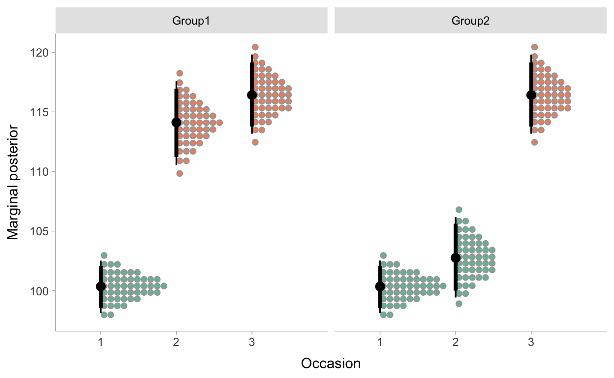
Figure 4: Marginal posterior distributions for the average scores of both groups at the 3 test occasions.
Actually, we now have two estimates of the effect of our intervention, one for each group in our experiment. One of the great advantages of Bayesian inferences is that it is very easy to propagate our uncertainties based on our model to other quantities. That maybe sounds somewhat difficult, but a practical example will possibly help. Let’s calculate effect sizes in the form of a Cohen’s d for the two effects we have. As a Cohen’s d is an expression of how many standard deviations two averages differ, this comes down to dividing our effect parameters in our model by a proper estimate of the standard deviation. Let’s settle with the standard deviation for the pretest as a basis to calculate a Cohen’s d in our example. For Group 1 students we can do this by dividing the parameter estimate for Group1 * Posttestscore1 with this standard deviation. For the students in Group2 we have to take the difference between the intercepts for both posttests and divide the result with our standard deviation. Let’s apply this in R:
Show code
# Calculate sd for pretest
sd_Pretest <- sd(Switch_data$Pretest_score, na.rm = T)

M4 %>%
  posterior_samples() %>%
  summarize(
    Group1 = median((b_Posttestscore1_Group1) / sd_Pretest),
    Group2 = median((b_Posttestscore2_Intercept - b_Posttestscore1_Intercept) / sd_Pretest)
  ) %>%
  select(Group1, Group2) %>%
  pivot_longer(everything()) %>%
  kbl(col.names = c("", "Cohen's d"),
      caption = "Cohen's d for the two groups",
      digits = 2) %>%
  kable_classic(full_width = T, html_font = "Fira mono")
| Cohen’s d | |
|---|---|
| Group1 | 0.84 |
| Group2 | 1.01 |
Both Cohen’s d’s are larger than .8 what is typically used as critical value to identify a large effect. So for both groups this point estimate points to large effects.
This is nice, but still. In this table I do not make full use of the information in the analysis. The uncertainty on our parameter estimates is not reflected when simply reporting point estimates. Let’s propagate our uncertainty. We can calculate a Cohen’s d for every draw we had in our MCMC sampling and visualize our most credible values of Cohen’s d’s for both groups as a density plot making use of dots. In the following plot I also added some background color scales to identify small, medium and large effect sizes:
Show code
P_effectsizes <- M4 %>%
  posterior_samples() %>%
  mutate(
    ES_Group1 = (b_Posttestscore1_Group1) / sd_Pretest,
    ES_Group2 = (b_Posttestscore2_Intercept - b_Posttestscore1_Intercept) / sd_Pretest
  ) %>%
  select(ES_Group1, ES_Group2) %>%
  pivot_longer(everything()) %>%
  mutate(X = ifelse(name == "ES_Group2", 1, 0)) %>%
  ggplot() +
  geom_rect(data=data.frame(xmin = -0.2, xmax = 2, ymin = 0, ymax = 0.2),
    aes(xmin=xmin, xmax=xmax, ymin=ymin, ymax=ymax), fill="#E64B35FF", alpha=0.4) +
  geom_rect(data=data.frame(xmin = -0.2, xmax = 2, ymin = 0.2, ymax = 0.5),
    aes(xmin=xmin, xmax=xmax, ymin=ymin, ymax=ymax), fill="#4DBBD5FF", alpha=0.4) +
  geom_rect(data=data.frame(xmin = -0.2, xmax = 2, ymin = 0.5, ymax = 0.8),
    aes(xmin=xmin, xmax=xmax, ymin=ymin, ymax=ymax), fill="#00A087FF", alpha=0.4) +
  geom_rect(data=data.frame(xmin = -0.2, xmax = 2, ymin = 0.8, ymax = 1.6),
    aes(xmin=xmin, xmax=xmax, ymin=ymin, ymax=ymax), fill="#3C5488FF", alpha=0.4) +
  stat_dotsinterval(aes(x=X, y=value, fill=I("white")),quantiles = 50) +
    ylab("Effect size (Cohen's d)") + coord_flip() +
  scale_y_continuous(breaks = c(0,0.2,0.5,0.8,1.1,1.4)) +
  scale_x_continuous(
    "",
    labels = c("Group1", "Group2"),
    breaks = c(0,1)) +
  theme_ggdist() +
  geom_text(
    data = data.frame(x=-0.1,y=0.35),
    aes(x=x,y=y,label = "small")
  ) +
  geom_text(
    data = data.frame(x=-0.1,y=0.65),
    aes(x=x,y=y,label = "medium")
  ) +
  geom_text(
    data = data.frame(x=-0.1,y=0.95),
    aes(x=x,y=y,label = "large")
  )


P_effectsizes
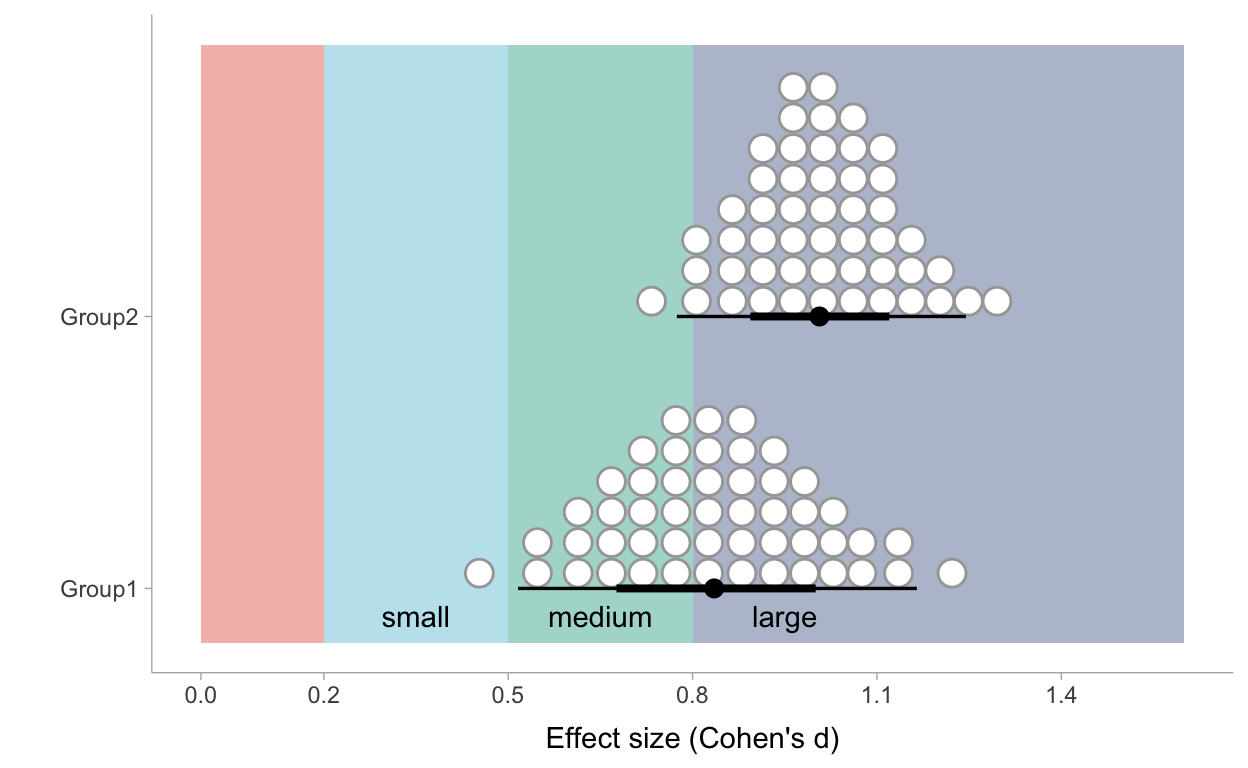
Figure 5: Posterior distribution of effect sizes of the intervention per group based on Model 4
Such a plot gives us more perspective! For Group1 we can conclude that we can be confident to state that ‘learning through case-comparison’ has at least a medium effect. Whether we can call it a large effect rather than a medium effect is more uncertain. If we look at the marginal probability of the Cohen’s d for Group 2 we can be more confident that the effect can be called a large effect.
Now, let’s take our example one step further and calculate a pooled Cohen’s d by combining both marginal posterior distributions. This pooled Cohen’s d could be considered as a sort of meta-analytic effect size of two studies:
Show code
P_effectsizes <- M4 %>%
  posterior_samples() %>%
  mutate(
    ES_Group1 = (b_Posttestscore1_Group1) / sd_Pretest,
    ES_Group2 = (b_Posttestscore2_Intercept - b_Posttestscore1_Intercept) / sd_Pretest
  ) %>%
  select(ES_Group1, ES_Group2) %>%
  pivot_longer(everything()) %>%
  mutate(X = .5) %>%
  ggplot() +
  geom_rect(data=data.frame(xmin = -0.2, xmax = 2, ymin = 0, ymax = 0.2),
    aes(xmin=xmin, xmax=xmax, ymin=ymin, ymax=ymax), fill="#E64B35FF", alpha=0.4) +
  geom_rect(data=data.frame(xmin = -0.2, xmax = 2, ymin = 0.2, ymax = 0.5),
    aes(xmin=xmin, xmax=xmax, ymin=ymin, ymax=ymax), fill="#4DBBD5FF", alpha=0.4) +
  geom_rect(data=data.frame(xmin = -0.2, xmax = 2, ymin = 0.5, ymax = 0.8),
    aes(xmin=xmin, xmax=xmax, ymin=ymin, ymax=ymax), fill="#00A087FF", alpha=0.4) +
  geom_rect(data=data.frame(xmin = -0.2, xmax = 2, ymin = 0.8, ymax = 1.6),
    aes(xmin=xmin, xmax=xmax, ymin=ymin, ymax=ymax), fill="#3C5488FF", alpha=0.4) +
  stat_dotsinterval(aes(x=X, y=value, fill=I("white")),quantiles = 50) +
    ylab("Effect size (Cohen's d)") + coord_flip() +
  scale_y_continuous(breaks = c(0,0.2,0.5,0.8,1.1,1.4)) +
  scale_x_continuous(
    "",
    labels = c("Pooled"),
    breaks = c(0.5)) +
  theme_ggdist() +
  geom_text(
    data = data.frame(x=-0.1,y=0.35),
    aes(x=x,y=y,label = "small")
  ) +
  geom_text(
    data = data.frame(x=-0.1,y=0.65),
    aes(x=x,y=y,label = "medium")
  ) +
  geom_text(
    data = data.frame(x=-0.1,y=0.95),
    aes(x=x,y=y,label = "large")
  )


P_effectsizes
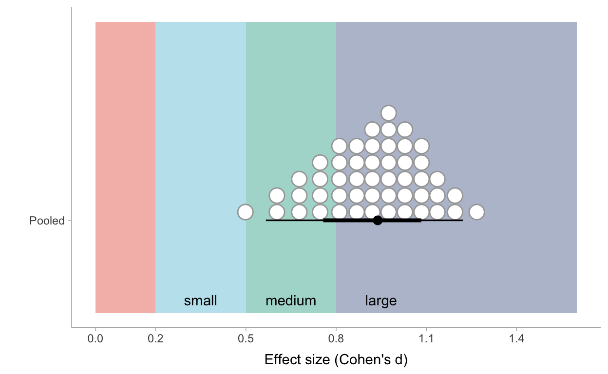
Figure 6: Posterior distribution of pooled effect sizes of the intervention based on Model 4
Very roughly one can see that 10 out of the 50 most credible values of the effect size are situated under the critical value of .8 which is commonly used to call an effect ‘large’. So the most cautious conclusion could be that we are very certain that ‘learning through case-comparison’ has at least a medium effect and we are about 80% certain it even has a large effect.
To wrap it up
I hope I have demonstrated the power of the combination of the switching replications design with Bayesian inferences! If you have any thoughts, remarks or suggestions based on this post, do not hesitate to use the discussion forum (see lower under our Appendix).
Appendix: how I sculptured the toy dataset
This code block is used to ‘sculpture’ the dataset used in this post. Not sure if it is the most efficient way of generating the data I wanted, but it worked.
Show code
library(faux)

## Start by simulating 150 pretest scores from the standard normal distribution
set.seed(1)
Pretest_score <- rnorm(150, mean = 0, sd = 1)

## Create random error for posttest1 that is correlated with Pretest_score
set.seed(2)
error1 <- rnorm_pre(Pretest_score, mu = 0, sd = 1, r = 0.6)

## Create random error for posttest2 that is correlated with error1
set.seed(3)
error2 <- rnorm_pre(error1, mu = 0, sd = 1, r = 0.65)

## Create a dummy variable that identifies Group1 students
Group1 <- c(rep(0,75), rep(1,75))

## Create a dummy variable that identifies Group2 students
Group2 <- c(rep(1,75), rep(0,75))

## Create a factor that identifies both groups
Group <- ifelse(Group1 == 1, "Group1", "Group2")

## Create a Gender variable (which we actually not use in this post)
set.seed(4)
Gender <- sample(c("female","male"), 150, replace=TRUE, prob = c(0.52, 0.48))

## Create a dummy variable for Girls used to calculate scores
Girl <- ifelse(Gender == "female", 1, 0)

## Calculate Posttest scores as a function of Group1 and Gender and rescale the scores
## to a a scale with average 100 and a standard deviation of 15
Posttest_score1 <- ((0.15 + 0.71*Group1 + 0.06 * Girl + 0.04*Girl*Group1 + error1)*15) + 100
Posttest_score2 <- ((0.91 + 0.17*Group2 + 0.02 * Girl + 0.02*Girl*Group1 + error2)*15) + 100

## Also rescale the pretest scores to a scale with average 100 and standard deviation 15
Pretest_score <- (Pretest_score * 15) + 100

## Wrapping it al together in a data frame and save the data
Switch_data <- data.frame(
  Gender, Group, Pretest_score, Posttest_score1, Posttest_score2, Group1
)

save(Switch_data, file = "data/Switch_data.RData")
Acknowledgments
Thank you Solomon Kurz for your blogpost on Regression models for 2-timepoint non-experimental data (https://solomonkurz.netlify.app/post/2020-12-29-regression-models-for-2-timepoint-non-experimental-data/)! It was an inspiration for this blogpost.
Also I wish to acknowledge the University of Antwerp for awarding my Sabbatical Leave. Without the sabbatical leave I wouldn’t have found the time to start my learning path on Bayesian analysis and Stan coding…
For the analyses presented analyses and the writing of this post, I used the programming language R (R Core Team 2020) through the interface RStudio (RStudio Team 2020). The following R packages were crucial (in random order): bayesplot(Gabry and Mahr 2020), brms (Bürkner 2018), DiagrammeR (Iannone 2020), dplyr (Wickham et al. 2020), faux (DeBruine 2020), ggplot2 (Wickham 2016), kableExtra (Zhu 2021) , knitr (Xie 2015), loo (Vehtari, Gelman, and Gabry 2017), patchwork (Pedersen 2020), rmarkdown (Allaire et al. 2021; Xie, Dervieux, and Riederer 2020), rstan (Stan Development Team 2020a), tidybayes (Kay 2020) and tidyverse (Wickham et al. 2019).
Alfieri, Louis, Timothy J. Nokes-Malach, and Christian D. Schunn. 2013. “Learning Through Case Comparisons: A Meta-Analytic Review.” Educational Psychologist 48 (2): 87–113. https://doi.org/10.1080/00461520.2013.775712.
Allaire, JJ, Yihui Xie, Jonathan McPherson, Javier Luraschi, Kevin Ushey, Aron Atkins, Hadley Wickham, Joe Cheng, Winston Chang, and Richard Iannone. 2021. Rmarkdown: Dynamic Documents for R. https://github.com/rstudio/rmarkdown.
Bürkner, Paul-Christian. 2018. “Advanced Bayesian Multilevel Modeling with the R Package brms.” The R Journal 10 (1): 395–411. https://doi.org/10.32614/RJ-2018-017.
DeBruine, Lisa. 2020. Faux: Simulation for Factorial Designs. Zenodo. https://doi.org/10.5281/zenodo.2669586.
Gabry, Jonah, and Tristan Mahr. 2020. “Bayesplot: Plotting for Bayesian Models.” https://mc-stan.org/bayesplot.
Iannone, Richard. 2020. DiagrammeR: Graph/Network Visualization. https://CRAN.R-project.org/package=DiagrammeR.
Kay, Matthew. 2020. tidybayes: Tidy Data and Geoms for Bayesian Models. https://doi.org/10.5281/zenodo.1308151.
Pedersen, Thomas Lin. 2020. Patchwork: The Composer of Plots. https://CRAN.R-project.org/package=patchwork.
R Core Team. 2020. R: A Language and Environment for Statistical Computing. Vienna, Austria: R Foundation for Statistical Computing. https://www.R-project.org/.
RStudio Team. 2020. RStudio: Integrated Development Environment for R. Boston, MA: RStudio, PBC. http://www.rstudio.com/.
Shadish, W. R., T. D. Cook, and D. T. Campbell. 2002. Experimental and Quasi-Experimental Designs for Generalized Causal Inference. Berkeley: Houghton Mifflin Company.
Stan Development Team. 2020a. “RStan: The R Interface to Stan.” http://mc-stan.org/.
———. 2020b. Stan Modeling Language Users Guide and Reference Manual. https://mc-stan.org.
Vehtari, Aki, Andrew Gelman, and Jonah Gabry. 2017. “Practical Bayesian Model Evaluation Using Leave-One-Out Cross-Validation and Waic.” Statistics and Computing 27 (5): 1413–32. https://doi.org/10.1007/s11222-016-9696-4.
Wickham, Hadley. 2016. Ggplot2: Elegant Graphics for Data Analysis. Springer-Verlag New York. https://ggplot2.tidyverse.org.
Wickham, Hadley, Mara Averick, Jennifer Bryan, Winston Chang, Lucy D’Agostino McGowan, Romain François, Garrett Grolemund, et al. 2019. “Welcome to the tidyverse.” Journal of Open Source Software 4 (43): 1686. https://doi.org/10.21105/joss.01686.
Wickham, Hadley, Romain François, Lionel Henry, and Kirill Müller. 2020. Dplyr: A Grammar of Data Manipulation. https://CRAN.R-project.org/package=dplyr.
Xie, Yihui. 2015. Dynamic Documents with R and Knitr. 2nd ed. Boca Raton, Florida: Chapman; Hall/CRC. https://yihui.org/knitr/.
Xie, Yihui, Christophe Dervieux, and Emily Riederer. 2020. R Markdown Cookbook. Boca Raton, Florida: Chapman; Hall/CRC. https://bookdown.org/yihui/rmarkdown-cookbook.
Zhu, Hao. 2021. KableExtra: Construct Complex Table with ’Kable’ and Pipe Syntax. https://CRAN.R-project.org/package=kableExtra.